-
New Mobile Gmail of Google Focuses on Improving User Experience
-
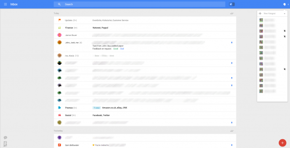
According to the Technology website Geek reported that the new mobile Gmail added some features look like on a desktop browser.
It is absolutely different to compare the new mobile Gmail user interface with the old one. The design of new user interface, which is based on their functionalities, can be compatible with various display screen sizes. Most importantly, it also pays more attention to the user experience.
On the left side list of Gmail system, Google removes the tab system which was bolted into Gmail and places it in a similar video service with collapsible Hangouts interface. The bubble window which is on the right corner will remind you when you have mails and alerts service. This simple interface tool can help users put these unfinished information or cautions store into a sort of ToDo list.
What’s more, the interface of new mobile Gmail also includes a brand new pin system, which replaces stars in Gmail. Users can use the toggle at the top of interface to drag your starred emails to the top of interface.
Google is always on the way to test the products and develop the potential new functions. Google doesn’t make a substantial change. And it is not clear when Google will issue this new mobile Gmail.
- # Android News
- # App Resources
- # Apple Devices
- # Apple News
- # Apple Software Tips
- # Google Glass
- # iPad News
- # iPhone News
- # iWatch
- # Keylogger Pro
- # Mac News
- # Mobile News
- # Tablet
- # TransPhone
TransPhone is a smart tool to synchronize your iPhone music, videos, apps to your computer. Free download the latest version of TransPhone below.
Download (Wins) Download (Mac)